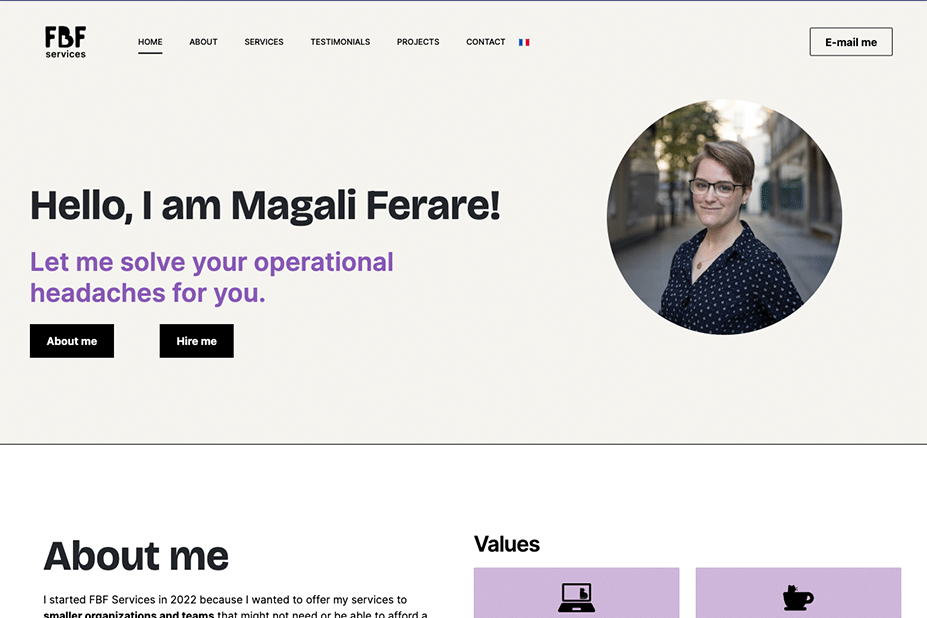
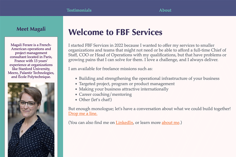
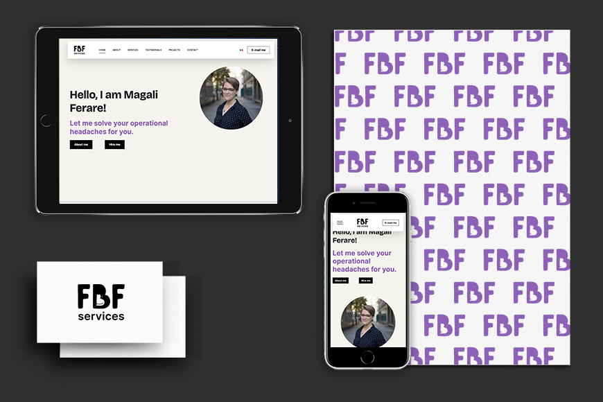
FBF-Services - Visual Identity & Website
Client
Fbf-Services
Project
Art Direction, UX / UI Design, Web Integration
Contexte
FBF-Services needed a clear visual identity and a coherent website to better communicate expertise and values. The goal was to create a recognizable brand, improve readability, and ensure accessibility and SEO compliance across the site.
Deliverables
Key skills
Before
After
Impacts
- Enhanced Brand Recognition: A distinctive logo and consistent branding improved visibility and identity.
- SEO Improvements: Better content organization led to improved search engine rankings
- Streamlined Information: The one-page layout with well-structured content allows users to quickly find information, saving time.
- Clear Communication of Services: The restructured content helps communicate the services offered more effectively, enhancing client trust.
- Clear Call-to-Actions (CTAs): Improved navigation and user journey enhance the likelihood of conversions, whether through contact forms or service inquiries.
Brand identity
Brand identity: Developed logo concepts exploring tone (playful vs. professional), finalized a balanced mark featuring subtle personality cues, and delivered a complete brand kit with typography, palette, and templates.
Phase 2: Website refresh
Audit & UX: Conducted usability, SEO, and accessibility audits (Bastien & Scapin criteria). Identified pain points in navigation, inconsistent menus, and poor content hierarchy.
Redesign: Proposed a one-page bilingual structure (FR/EN) to streamline information and improve load speed. Added horizontal scroll sections to support both quick scanning and detailed reading.
Integration: Built and tested the final design in Figma and WordPress, implementing responsive layouts and optimized HTML/CSS.
My initial audit (Bastien & Scapin criteria, and quick accessibility & SEO audit) highlighted the following problems on the site that needed to be addressed:
- Navigation
Pain point
One of the biggest problems was the header menu which was not the same on all pages, and the contact information could not be found on each page.
Solution
Creating a header and footer that are clear and direct the user to contact FBF-services was one of the priorities.
- Content
Pain point
Many existing pages did not have enough content, which was a problem for the user journey and for SEO. Some other pages had a very high information density.
Solution
We decided to go with a one-page site and reorganize all of the content and hierarchize information.
- User journey
Pain point
On a one-page site, some users will want to quickly browse the site to see if FBF-services meets their needs, others will want to take the time to learn about Magali’s professional background.
Solution
We decided to add a horizontal scroll section which allows you to browse the site in the blink of an eye or take the time to browse each section.
Wireframes
Design, integration & delivery
I then designed the website on Figma then integrated the final site and its 404 page.


