DiarseConsulting : Logo & Visual Identity, Website
Client
DiaRSE Consulting
Digal Consulting
Project
Logo, brand guidelines, website
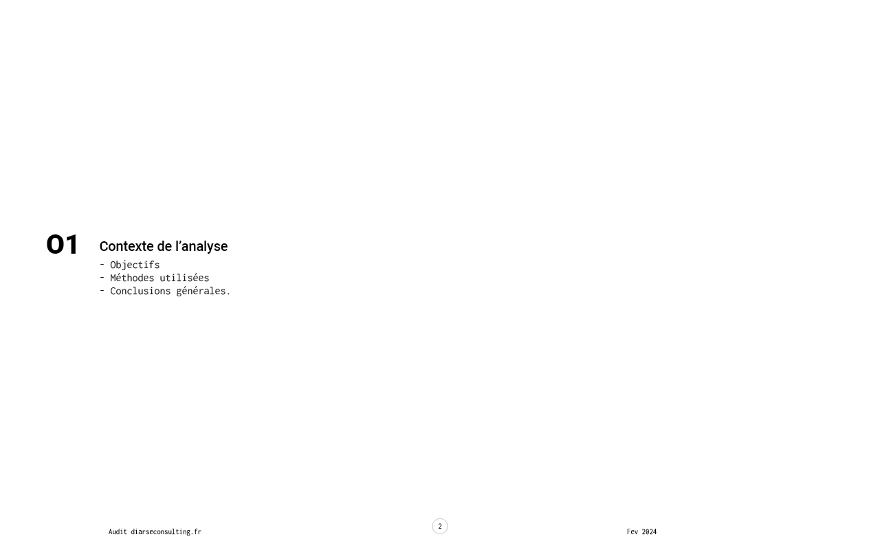
Context
After several years of activity, Dialor decided to rework his entire marketing strategy with the company Digal Consulting, who then contacted me to redesign the logo and website of Diarse Consulting who specializes in CSR (Corporate Social Responsibility).
The redesign of Diarse Consulting’s logo and website aims to establish a strong, cohesive brand identity that reflects its CSR expertise. The objectives include creating a professional, sustainable, and accessible design, optimizing the website for UX and SEO, and aligning all elements with CSR principles to enhance credibility, engagement, and sustainability in digital presence.
Deliverables
Phase 1: Visual identity
New logo
Brand guidelines
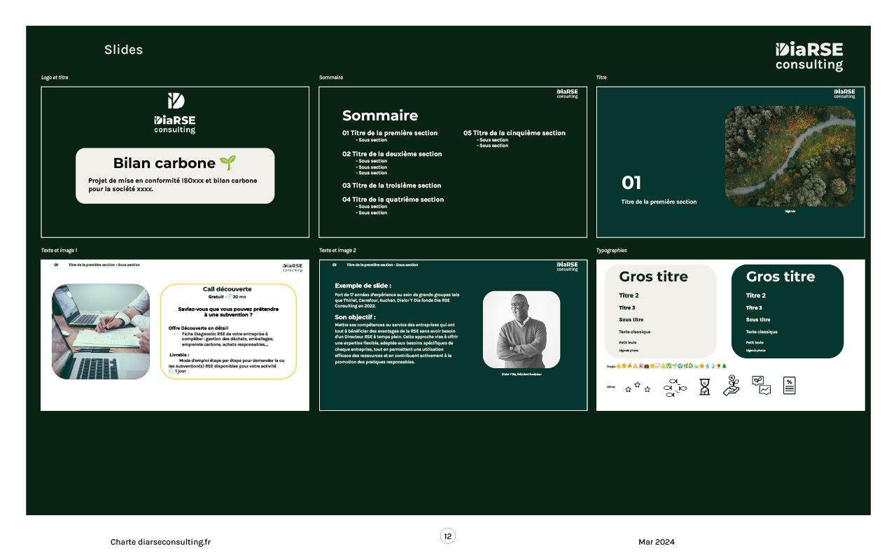
Templates for presentations
Emailing signature
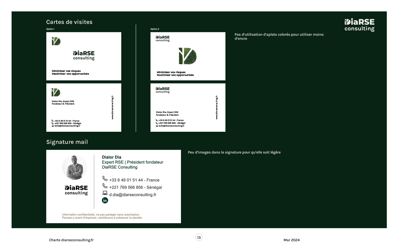
Business cards
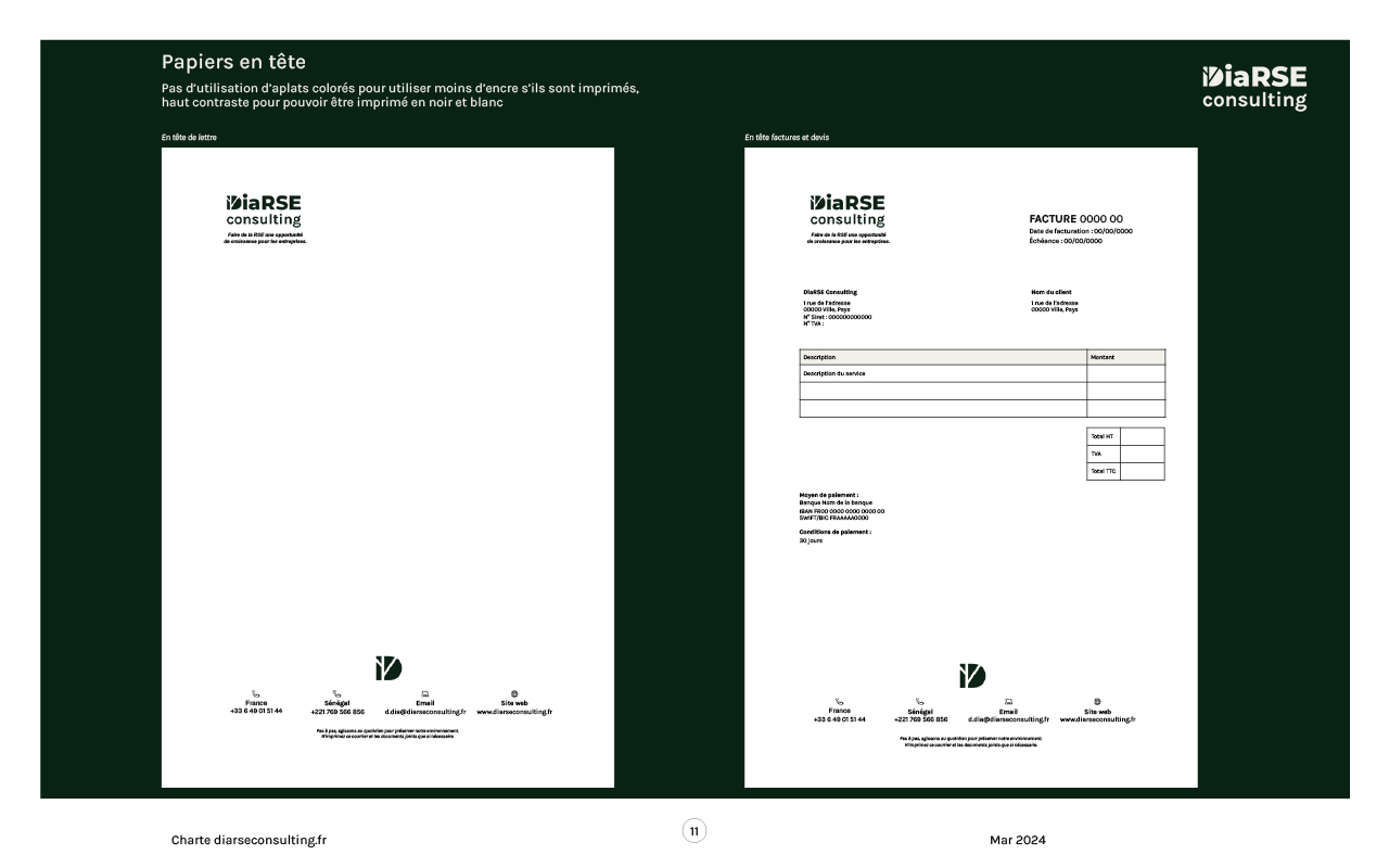
Letterheads, invoices
Phase 2: Website refresh
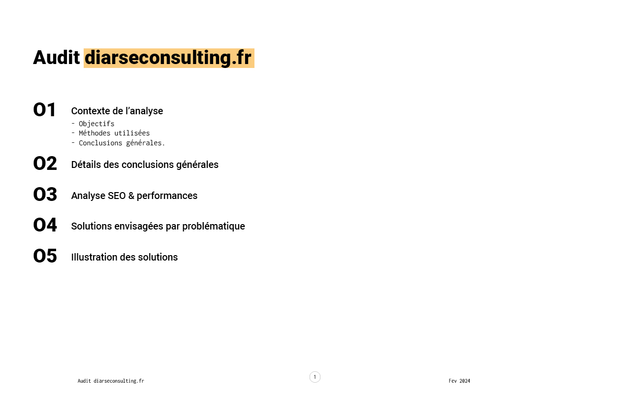
Audit
Website FR
Documentation
Key skills
Graphic design
UX, SEO & accessibility Audit
Wireframes & design on Figma
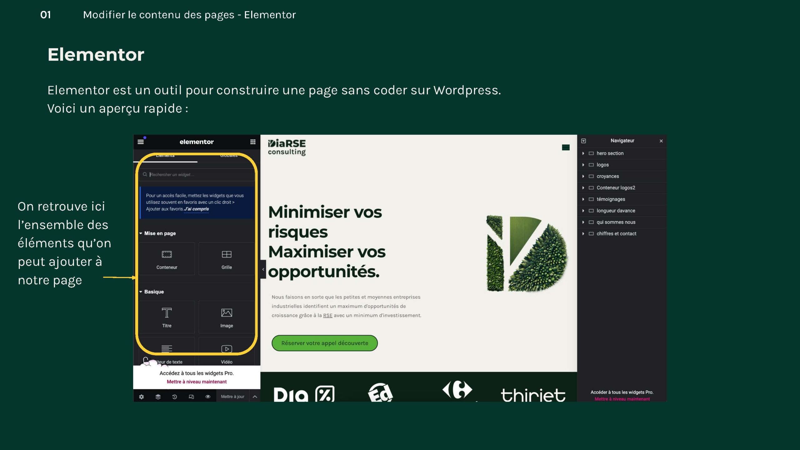
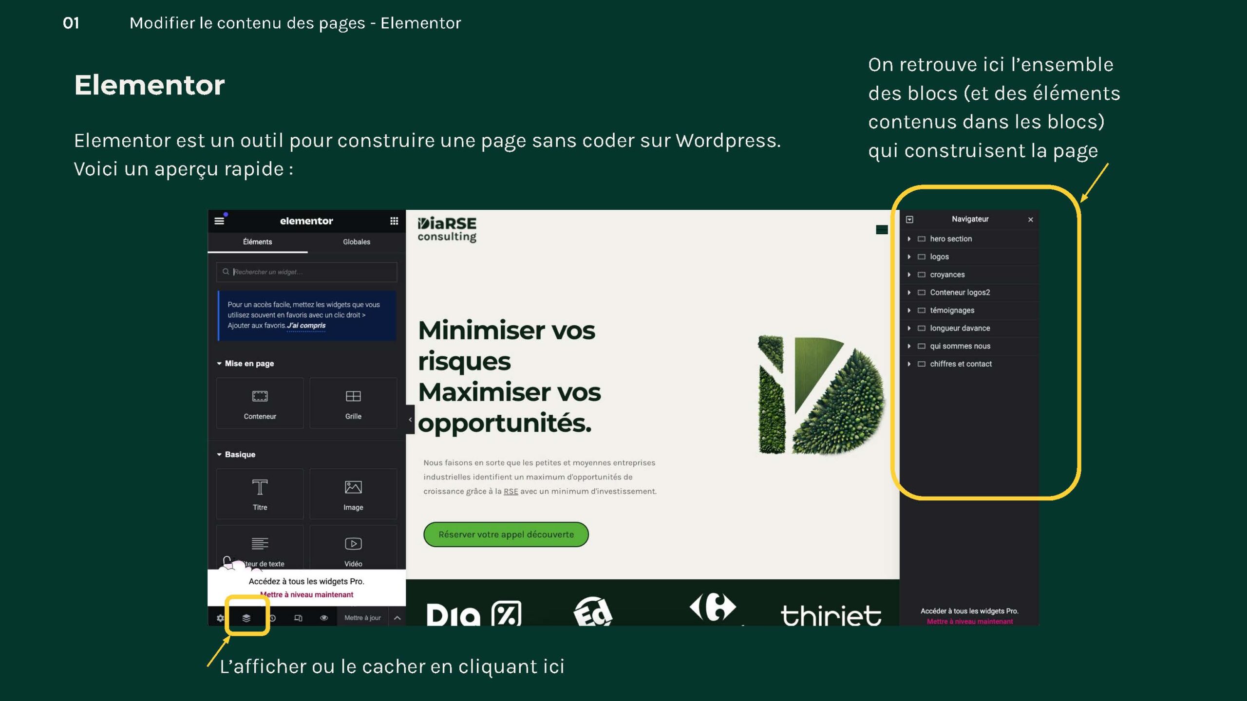
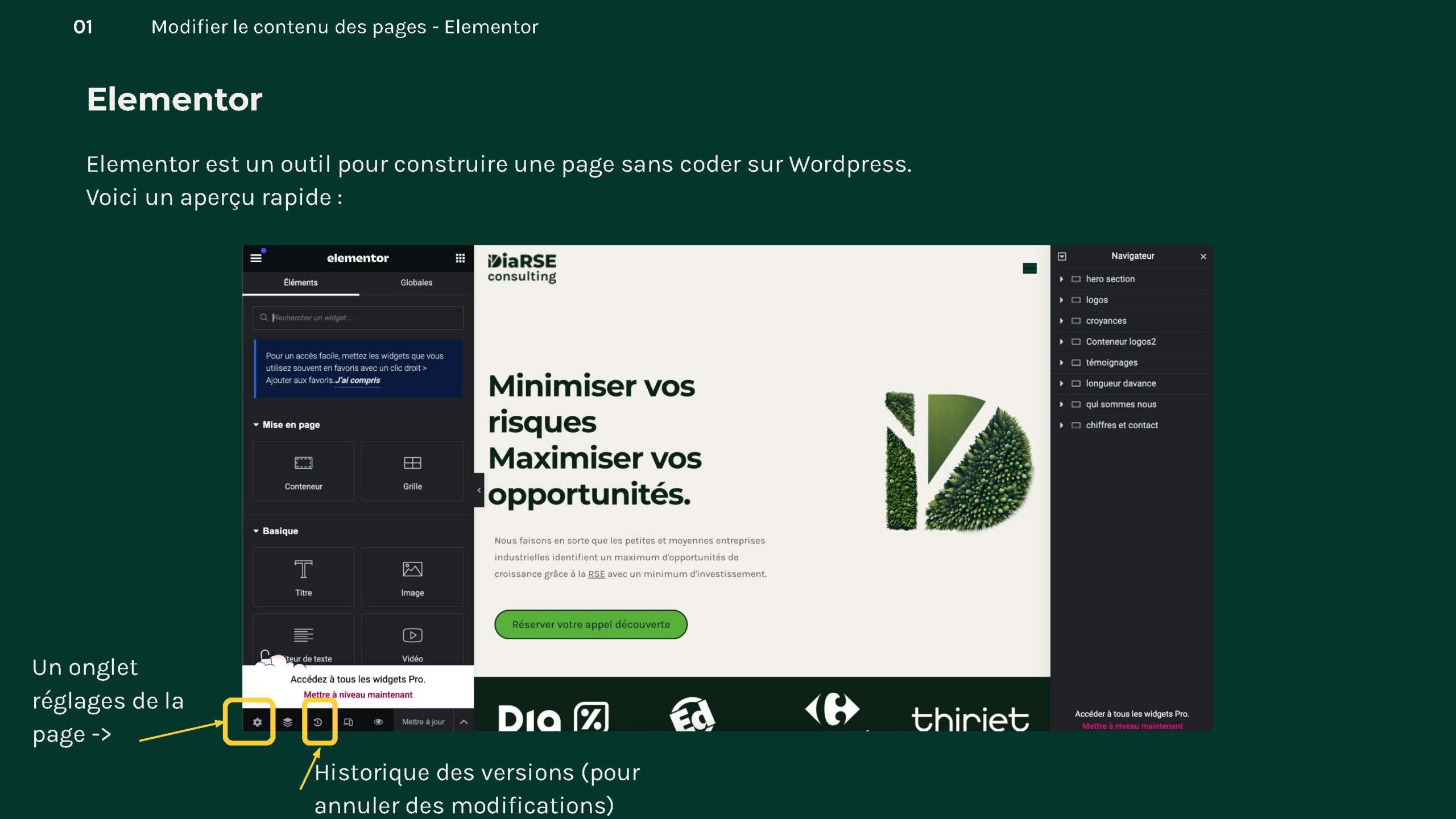
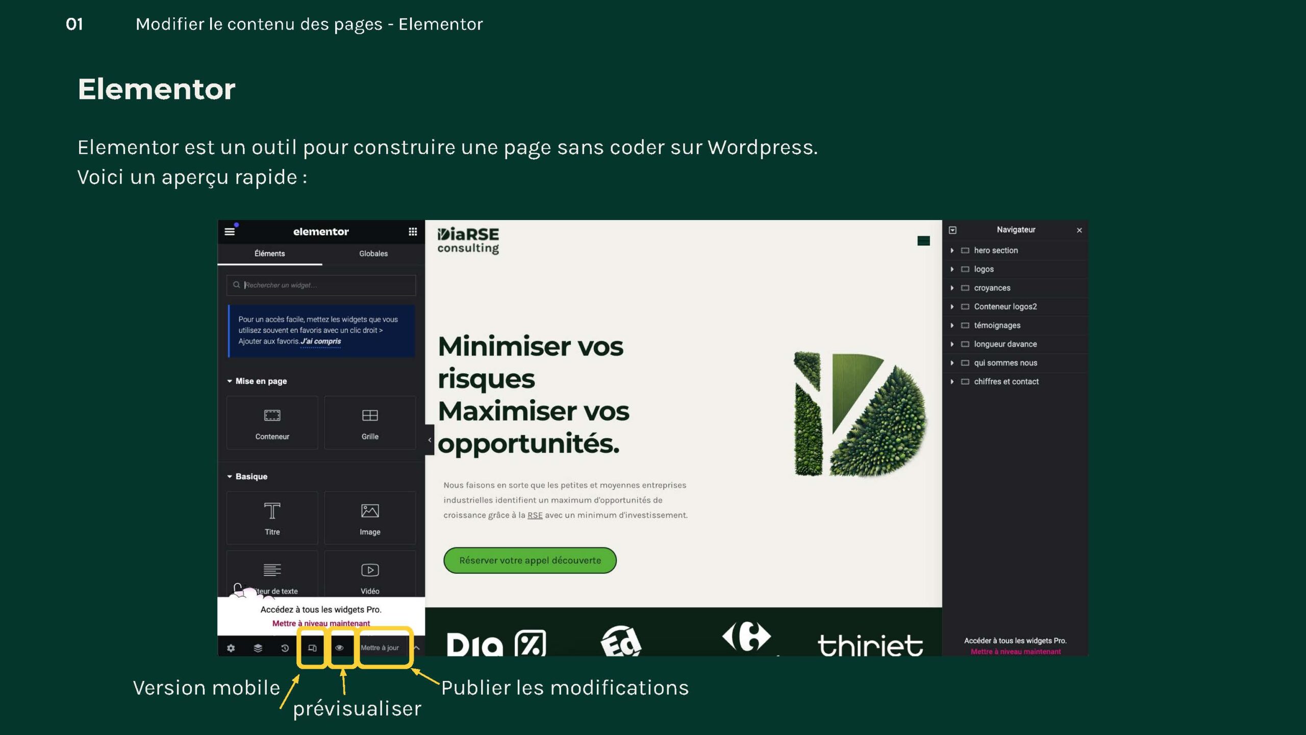
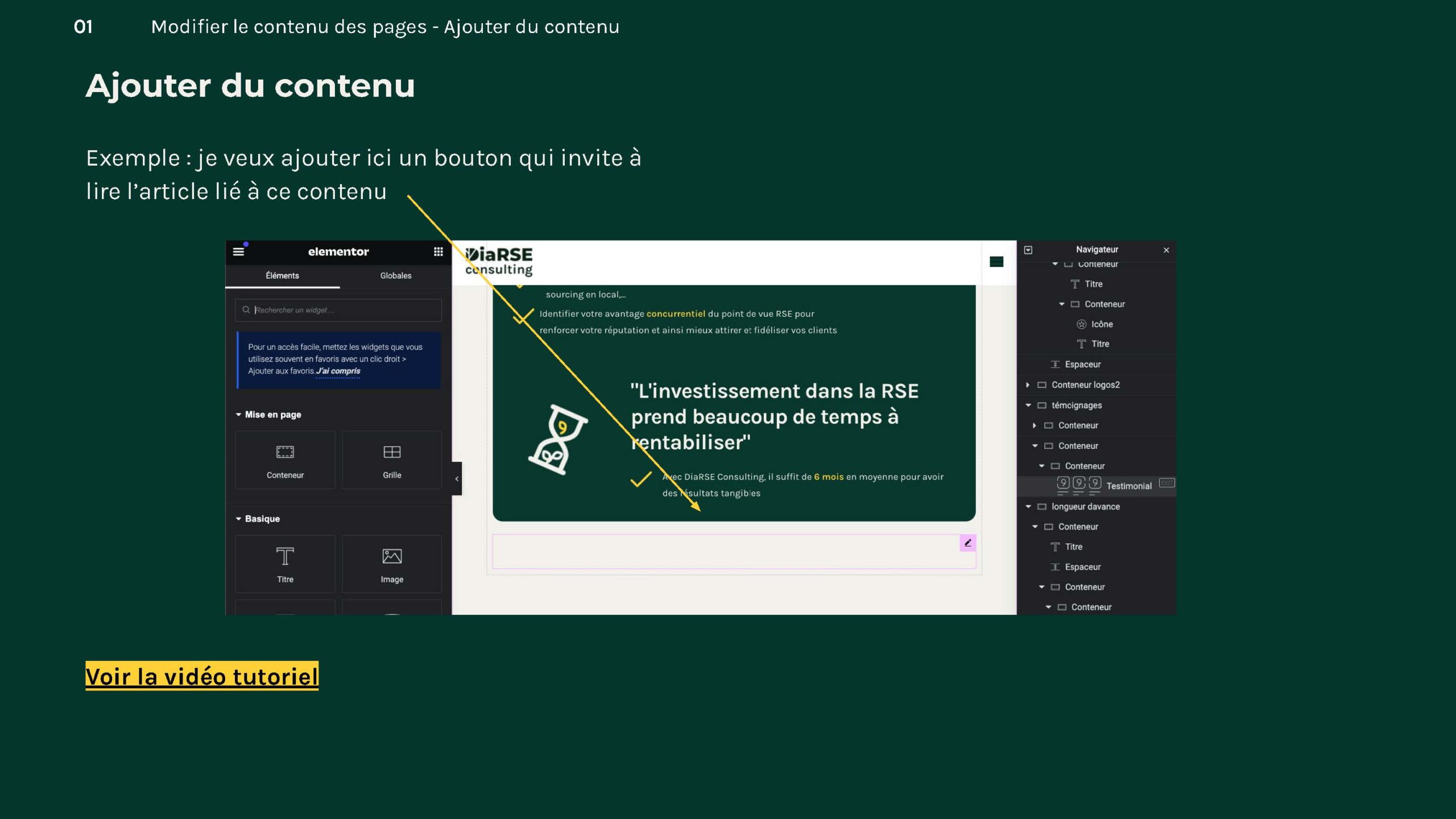
WordPress & Elementor
Before
After
Impacts
consistent aesthetic, building trust with potential clients
significantly improved user experience
a more inclusive platform that allows all users, including those with disabilities, to access information easily
enhanced communication and potential engagement (contact methods were unusable)
and the streamlined menu navigation now enables users to find information much faster.
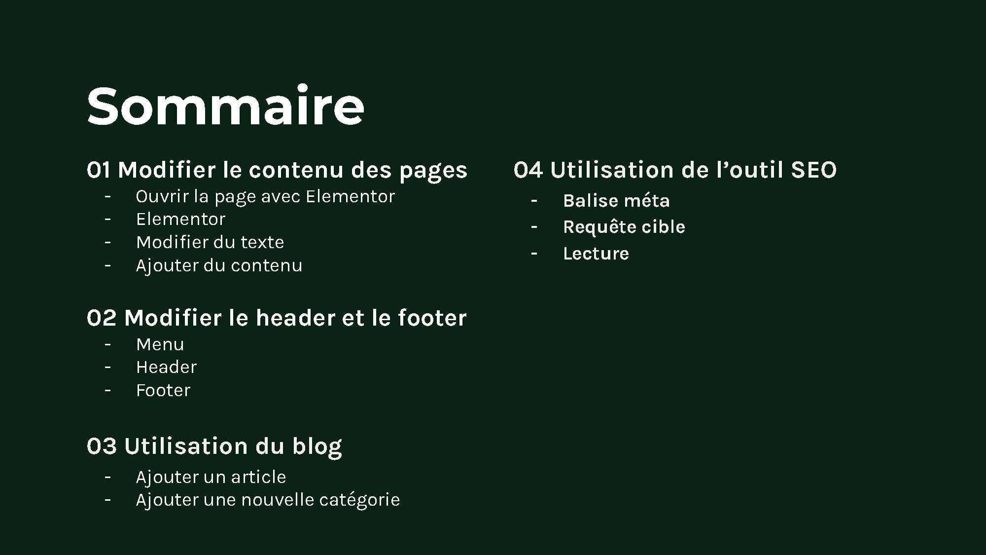
I provided comprehensive documentation and tutorials that empowers the client to manage and update their website independently
halved the website’s CO2 emissions, demonstrating DiaRSE’s commitment to sustainability while enhancing the overall user experience.
Phase 1: Visual identity
Milestones:
Kickoff
Draft concepts for approval
Revisions
Delivery
Progress
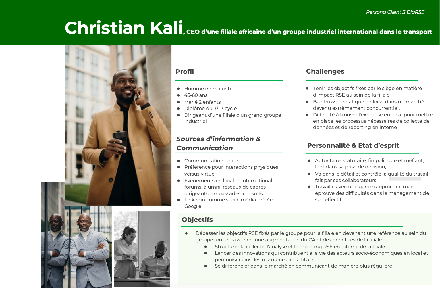
It was important that the logo reflect Dialor’s activity and values (sustainable development, social equality, modernity, innovation) while being reliable and serious.
The old logo had the following problems
Company name illegible in small format,
it has no variations for other formats
can gain in clarity and simplicity
the name of the company is not highlighted
Old logo
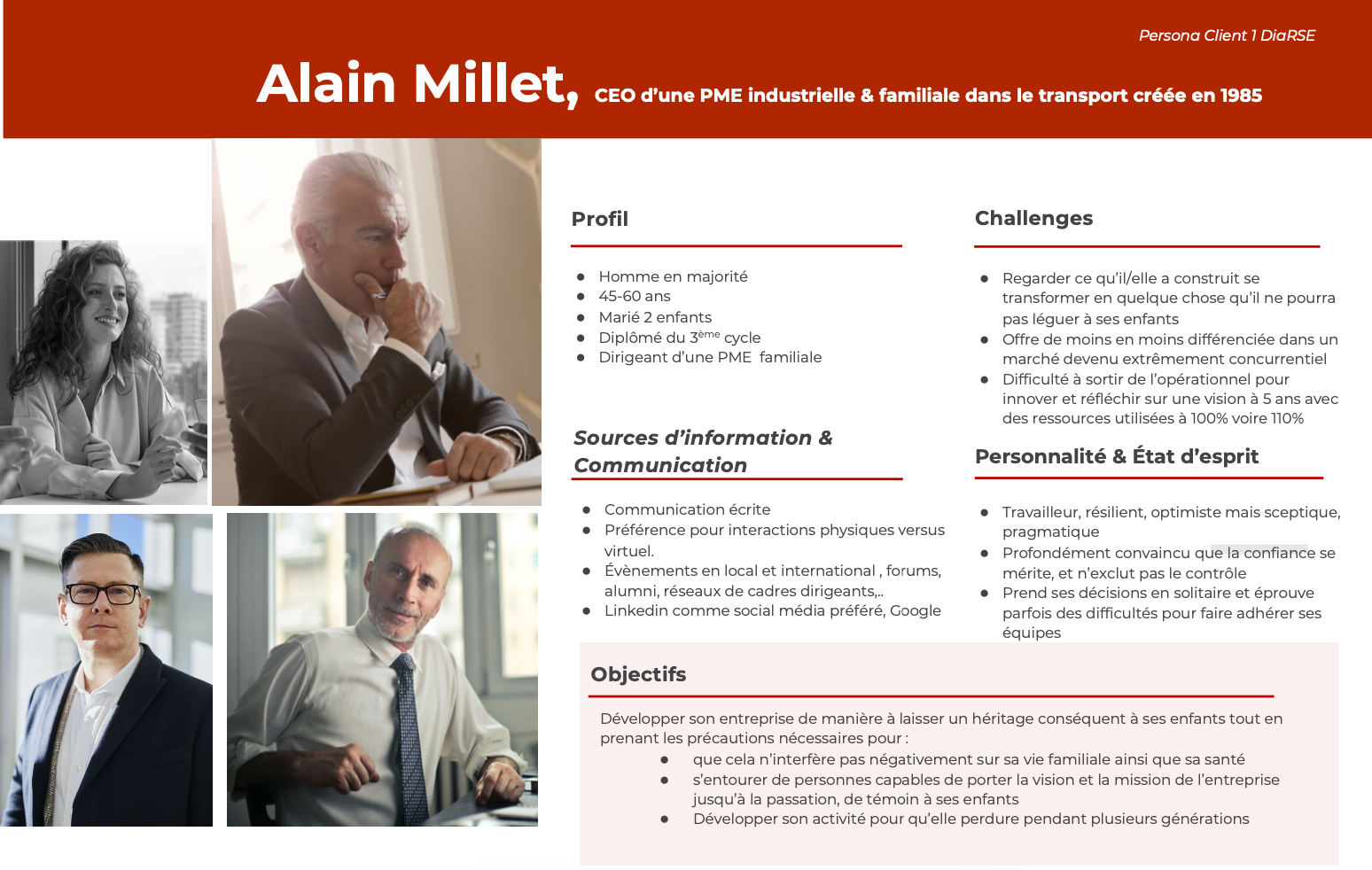
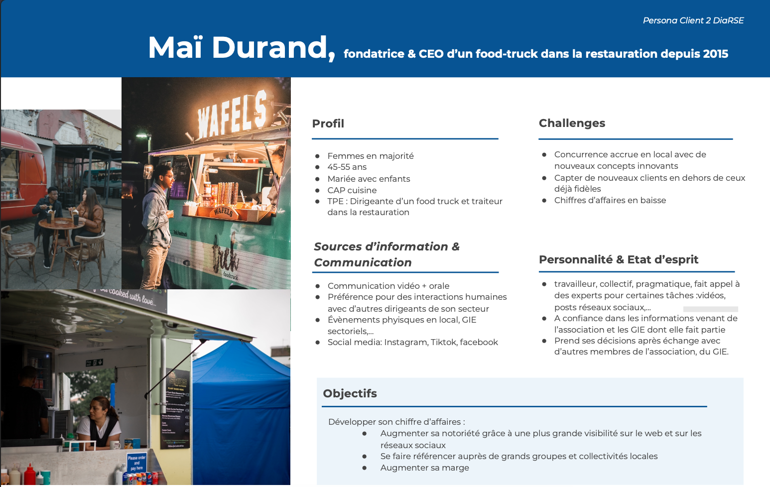
Digal Consulting identified three personas and their purchasing journeys, which allowed them to reposition the brand.
Persona 1 DiaRSE Consulting
Persona 2 DiaRSE Consulting
Persona 3 DiaRSE Consulting
Concept: logos proposals
Concept 1 : refresh
The outlines and white spaces are standardized
The format is close to a square to be readable in small format
The company name is better integrated into the logo and is legible and highlighted.
Concept 1
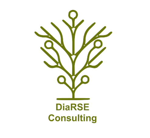
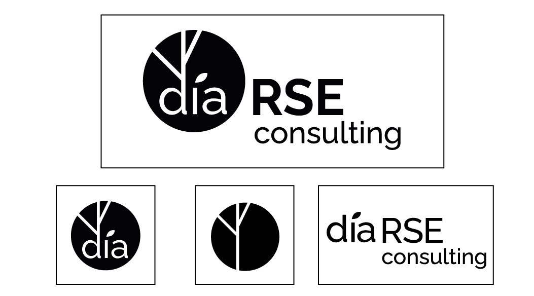
Concept 2 : reinterpretation
The logo is reworked to be more organic and is broken down into several graphic elements that can be used on their own. It highlights sustainable development, growth and fulfillment.
Concept 2
Concept 3 : simpler
Sustainable development, growth and fulfillment are always highlighted while evoking a more modern, more sober and simple image.
Concept 3
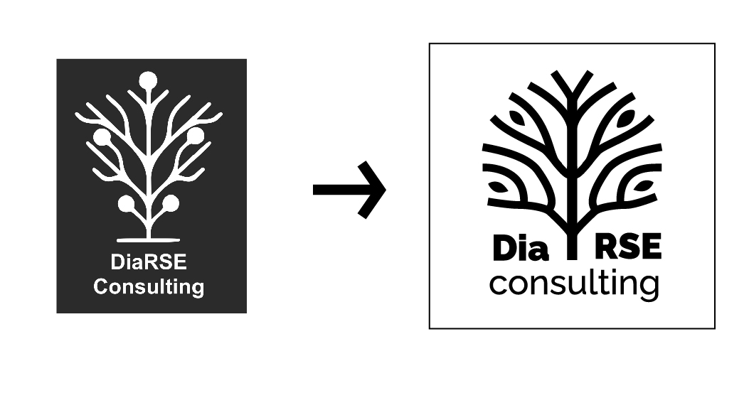
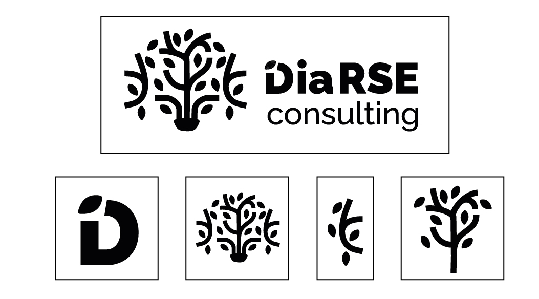
Concept 4 : simpler again
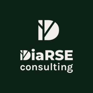
The D is tiled to represent a tree, the logo is less literal than the other concepts. Its simplicity evokes reliability, competence, modernity.
Concept 4
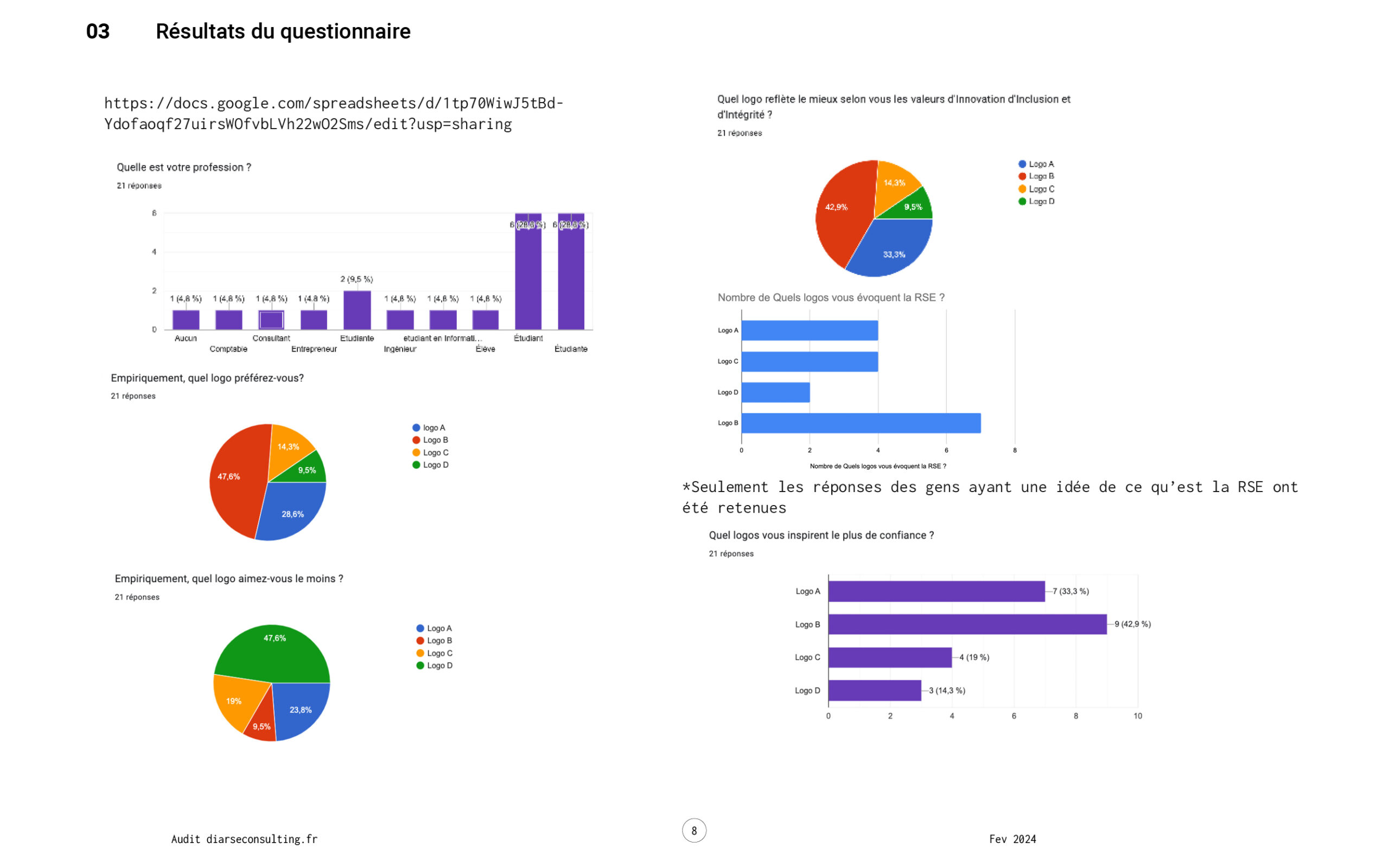
User feedback
I set up a questionnaire to survey Dialor’s potential customers and help it choose the logo that best suits its business. Logo 2 seemed to be liked by the most people, and logo 4 was the most divisive.
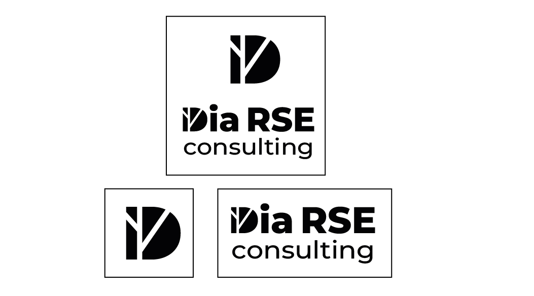
Delivery
Logo choice
Concept 4 was finally chosen for its simplicity, it was very suited to the first persona which represents a large part of DiaRSE Consulting’s clients.
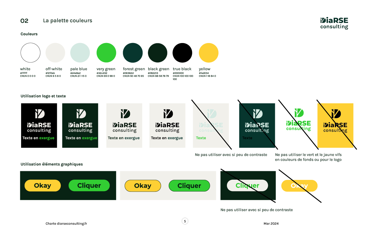
Colours
To reflect Dialor’s commitment to sustainability, I proposed reducing the carbon footprint of his website. This is reflected in the choice of colors for the graphic charter. OLED displays are becoming more and more popular and will increase over the next decade. Google found that using dark colors on these screens consumed 30-65% power. They also found that blue used 25% more energy than green or red.
We therefore chose a palette based on green, which reflects this commitment both in substance and form.
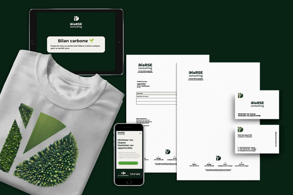
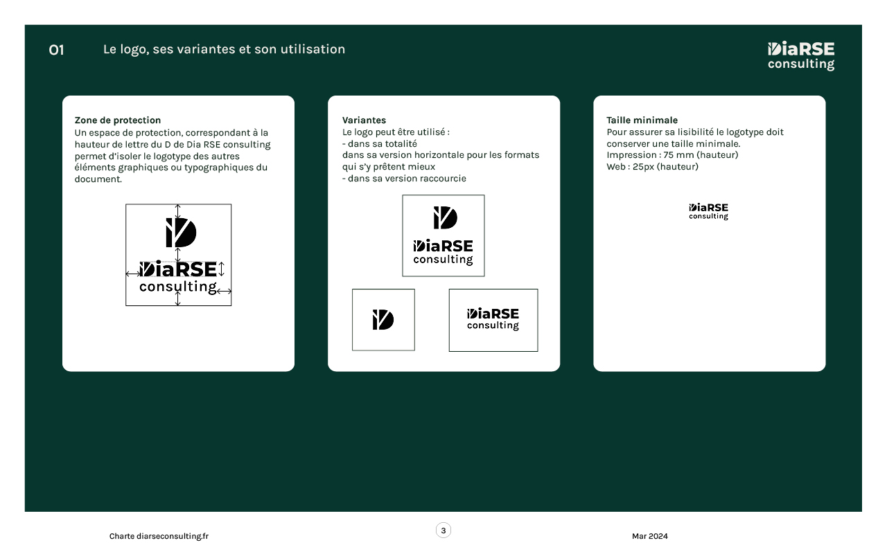
Brand guidelines
I then created the Brand Guidelines and delivered the following:
Web logo
Print logo
Vectorial logo
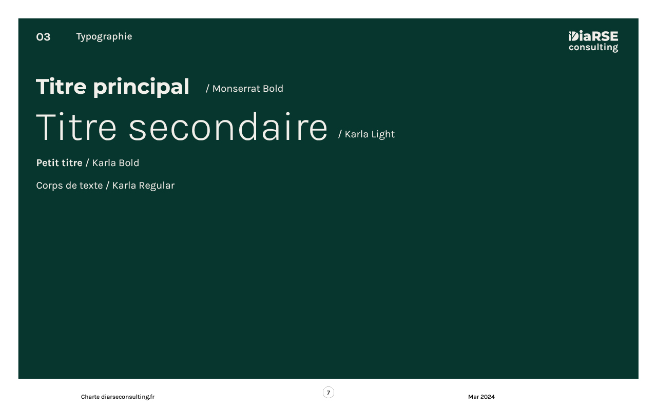
Visual identity, fonts
Color palette
Slides layout
E-mailing signature
Business cards
Letterheads, Invoices
Phase 2: Website refresh
Milestones:
Kickoff
Audit
Wireframes
Design
Integration on WordPress
Delivery
Progress
The website lacked a consistent aesthetic and was designed without consideration of UX, accessibility, carbon footprint or SEO principles. Many pages were written with technical jargon that was not understandable for their clients who are not CSR experts.
His requirements were that it be simple, with clear messages and have a consistent visual identity.
To reflect Dialor’s commitment to sustainable development, I proposed to reduce the carbon footprint of their website, and to reflect its values of social equality I also proposed to improve its accessibility.
Audit
Old homepage
old homepage 2
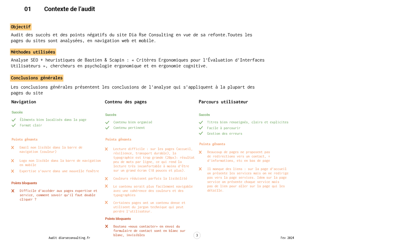
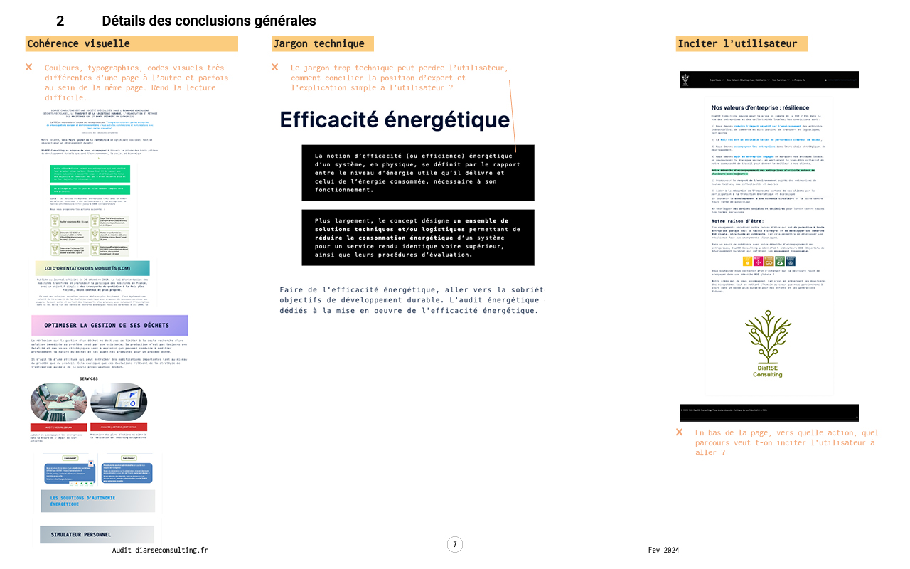
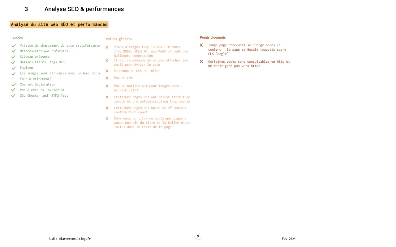
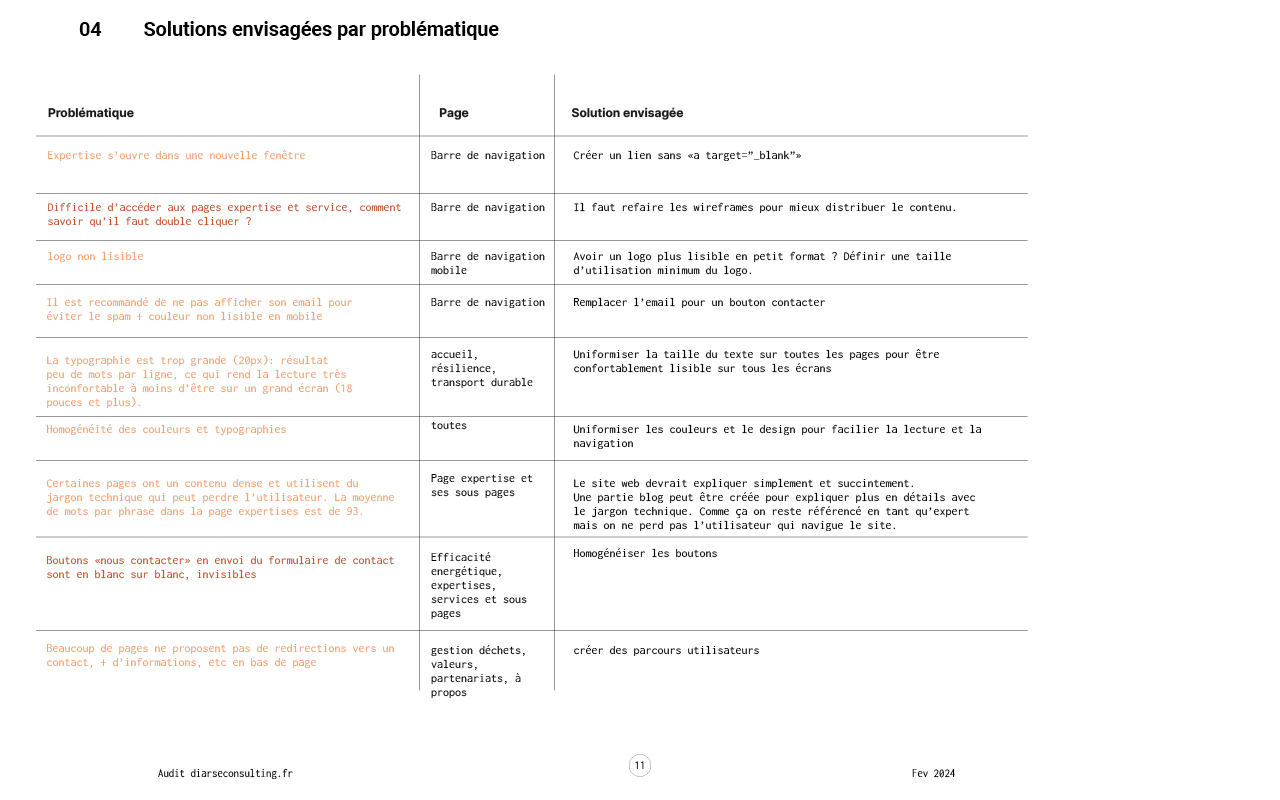
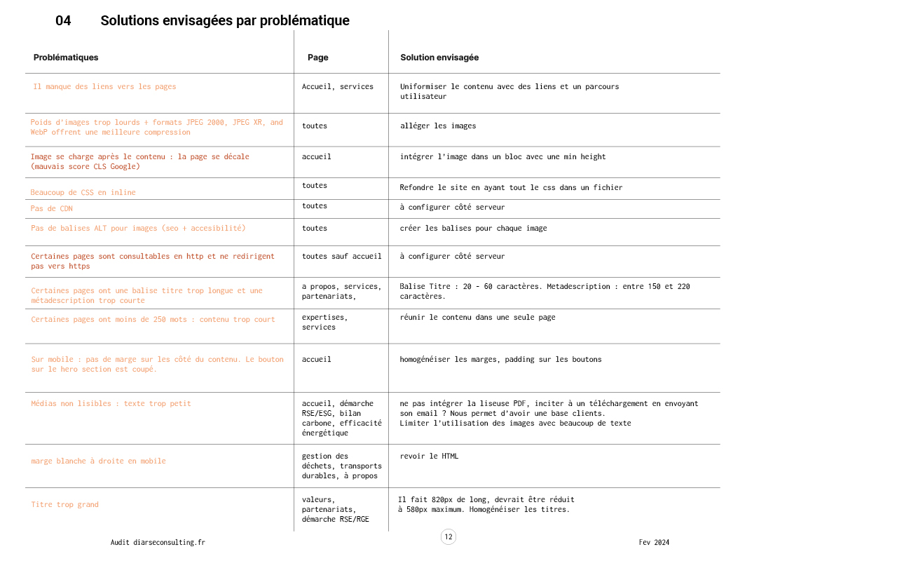
My initial audit (Bastien & Scapin criteria, and quick accessibility, sustainability & SEO audit) has allowed us to highlight the following problems on the site that needed to be addressed:
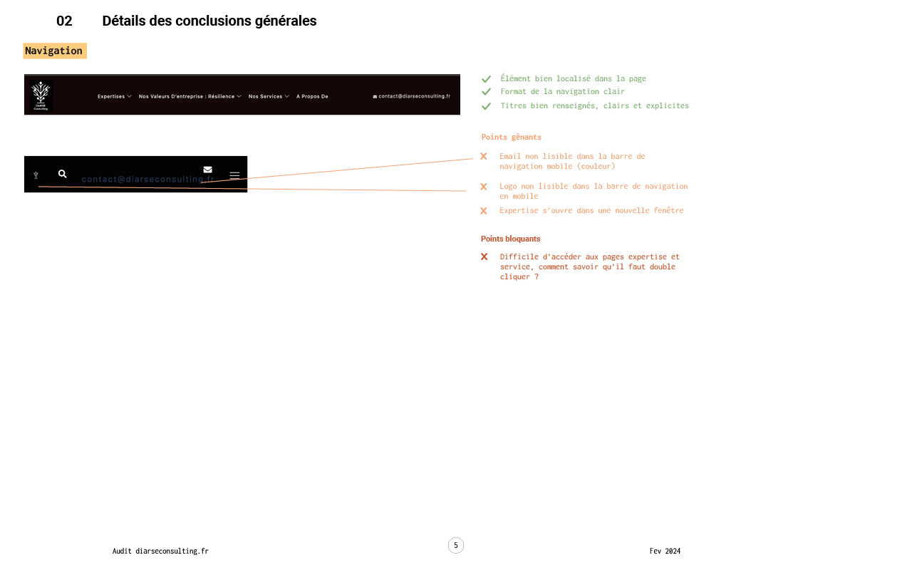
Navigation
Pain points:
Illegible contact email color
Logo unreadable on mobile
One of the menu items opens in a new window
The mega menu pages are difficult to access.
Solutions:
A simpler user journey
A smaller menu
Responsive and readable navigation
Content
Pain points:
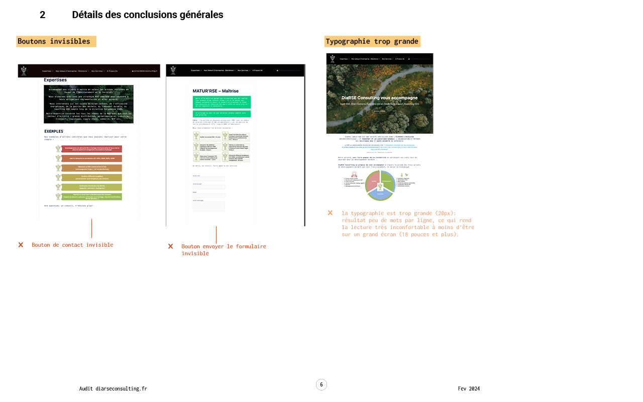
No consistency between the paragraphs and titles of the different pages (size, typography, color) which makes the site difficult to read and navigate.
Reading is sometimes difficult on mobile and tablet (too few words per line).
Colors sometimes reduce readability.
The content of the pages is sometimes too dense, with a lot of technical jargon and long sentences (20+ words). Our user personas showed it is crucial to simplify the language used throughout the site, making it accessible to clients who are not CSR experts.
The “contact us” button is invisible.
Solutions:
Creating a consistent design system allows us to resolve readability issues.
The content of the pages has been rewritten and simplified by Digal Consulting.
User journey
Pain points:
Menu too complicated to navigate
Some pages don’t have enough content and others have too much content.
Many pages do not offer redirection to contact, more information, etc. at the bottom of the page, which encourages the user to leave the site.
There are missing links between the pages e.g.: the home page presents the services but there is no link to the “services” pages.
Solutions:
Reduce the number of pages
Creating a wireframe will allow us to better organize the content and build a simpler user journey.
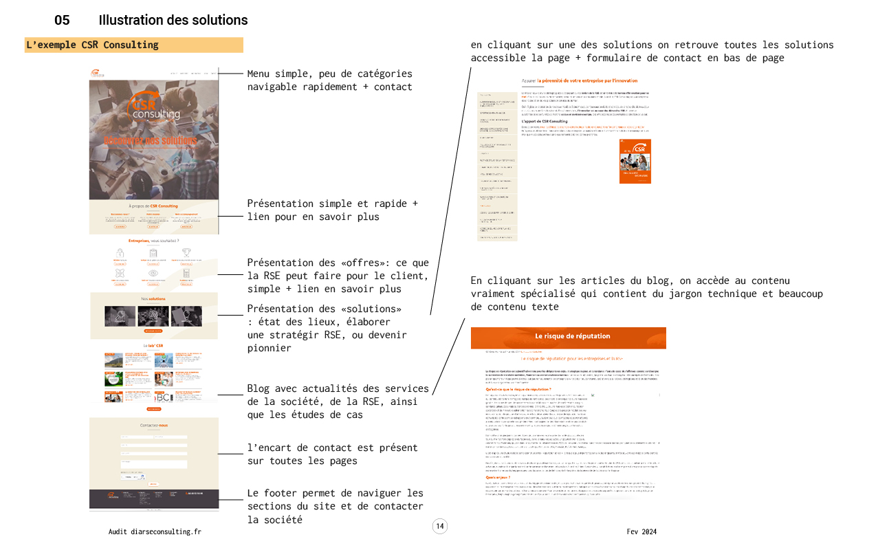
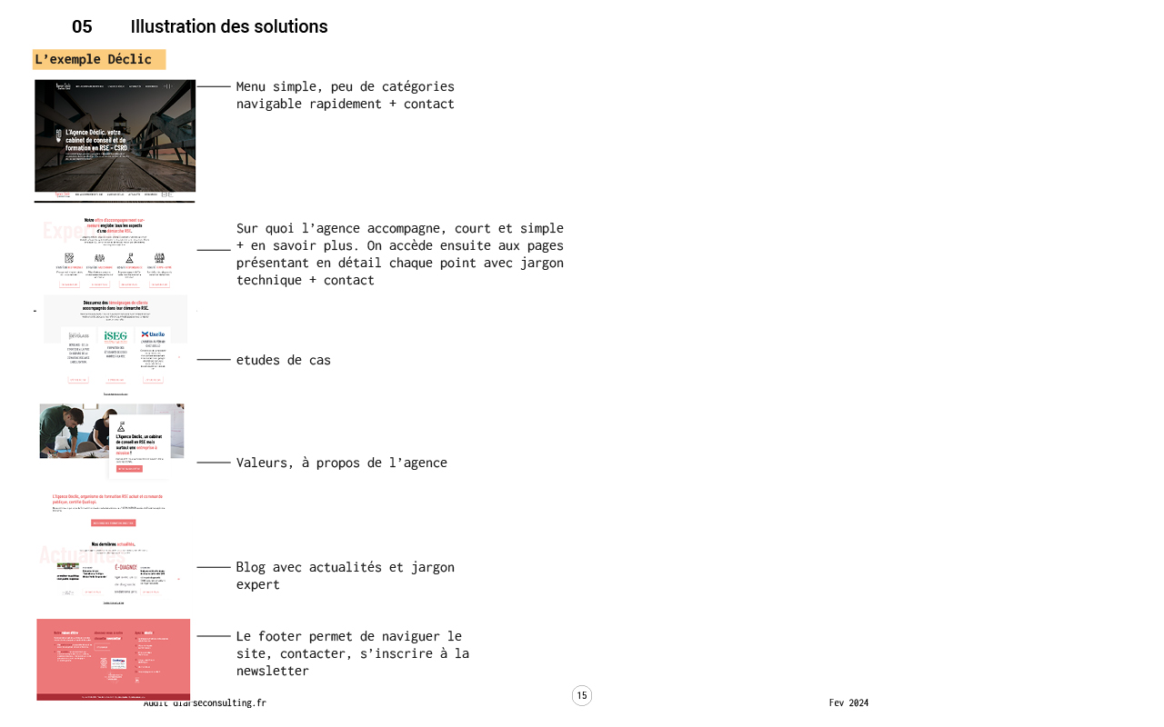
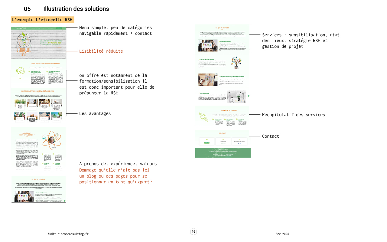
Based on the benchmark provided by Digal Consulting, I then illustrated these solutions at the end of my audit to give a clear idea of the changes we were going to make.
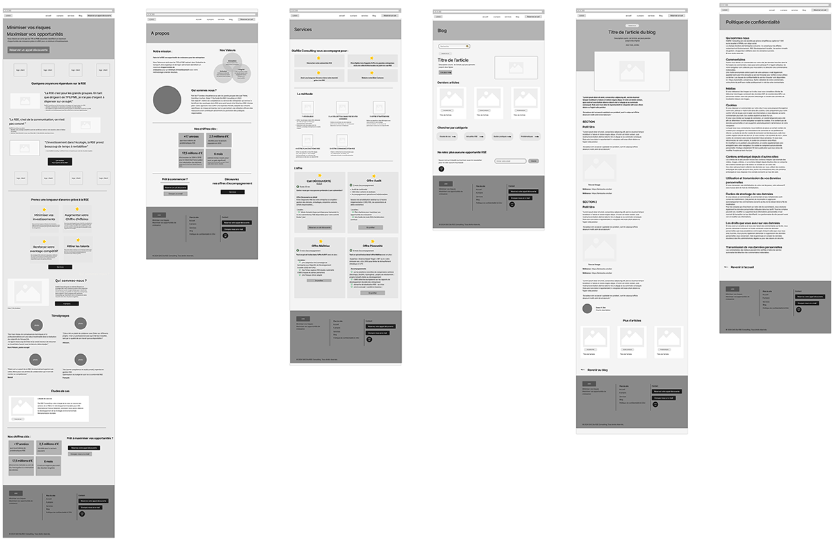
Wireframes
Design, integration & delivery
The three personas identified by Digal Consulting allowed them to rewrite the content of the site. The benefits for DiaRSE customers have been highlighted and simplified, simple and clear offers have been developed.
Together we reviewed the architecture of the site to have a simpler and more fluid user journey adapted to these personas and the new brand messages. The site now has 6 pages instead of 14.
Wireframes DiaRSE Consulting
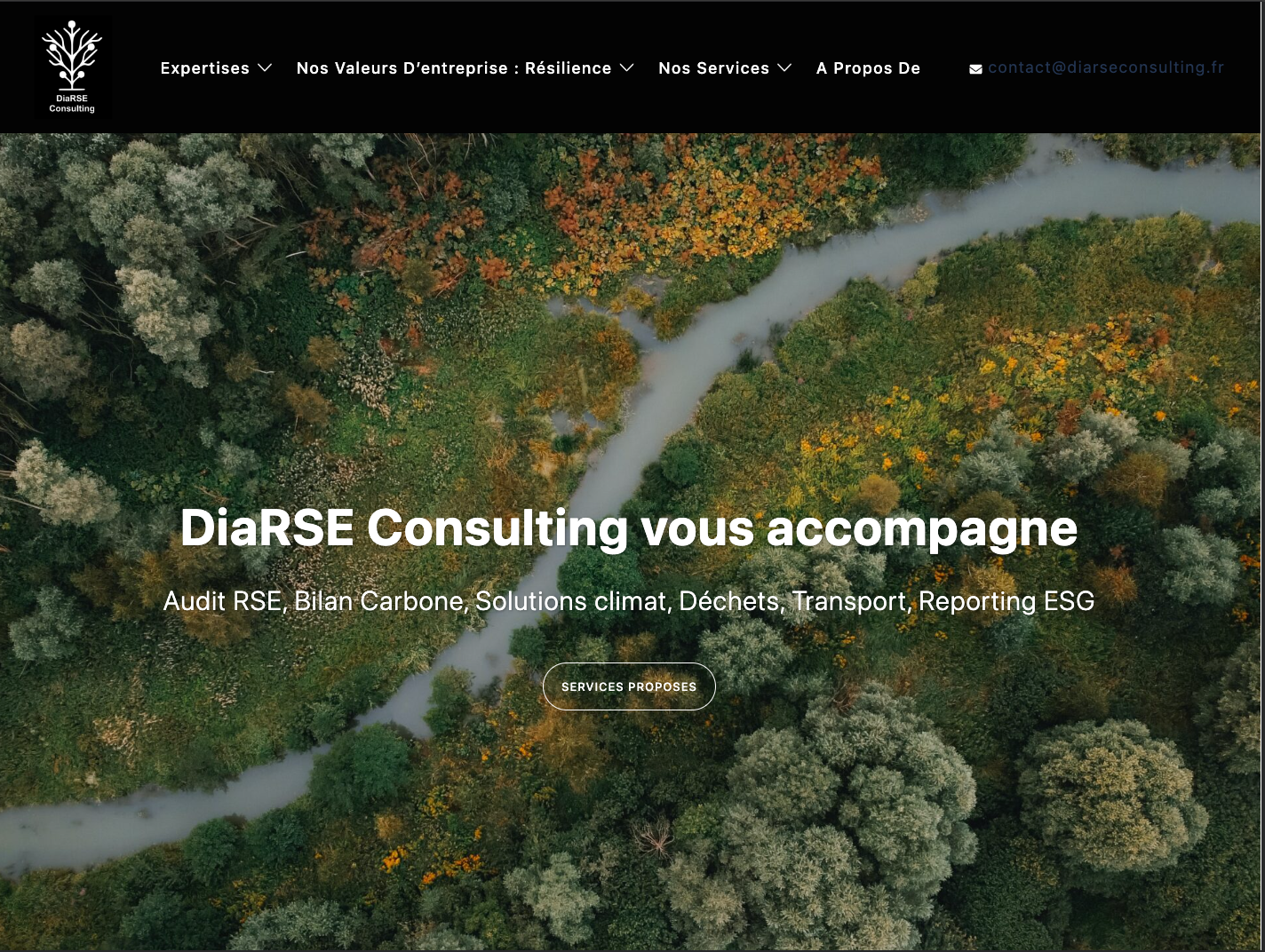
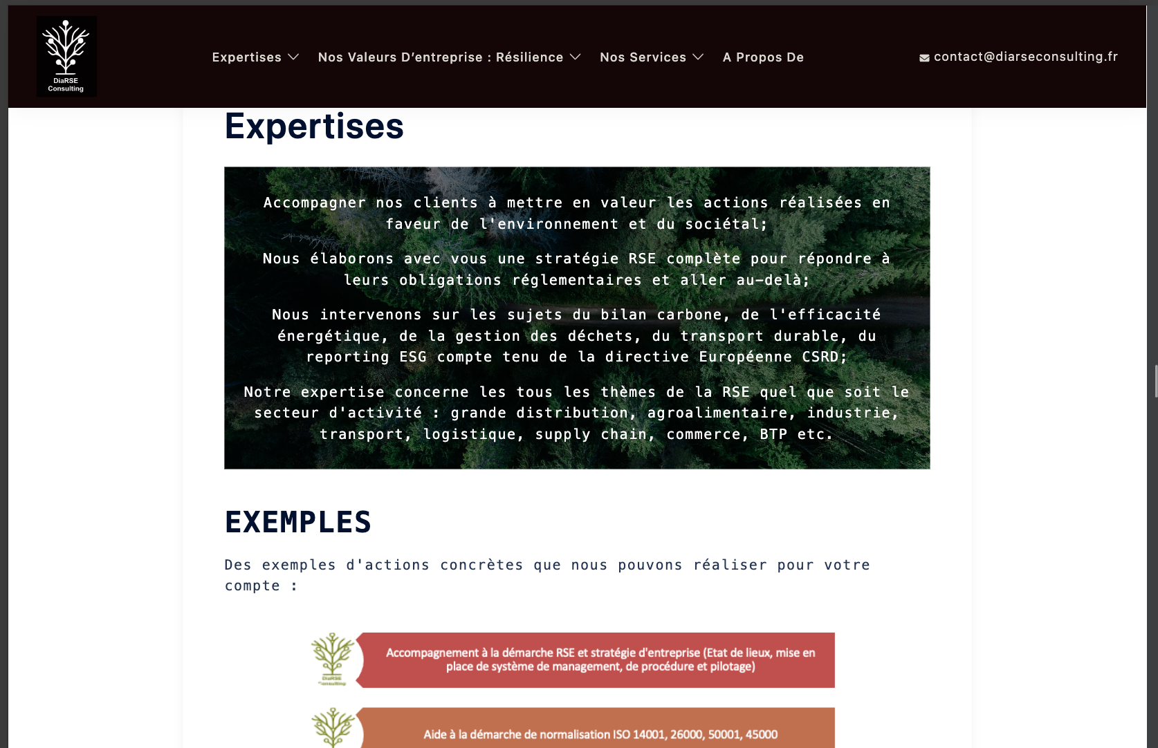
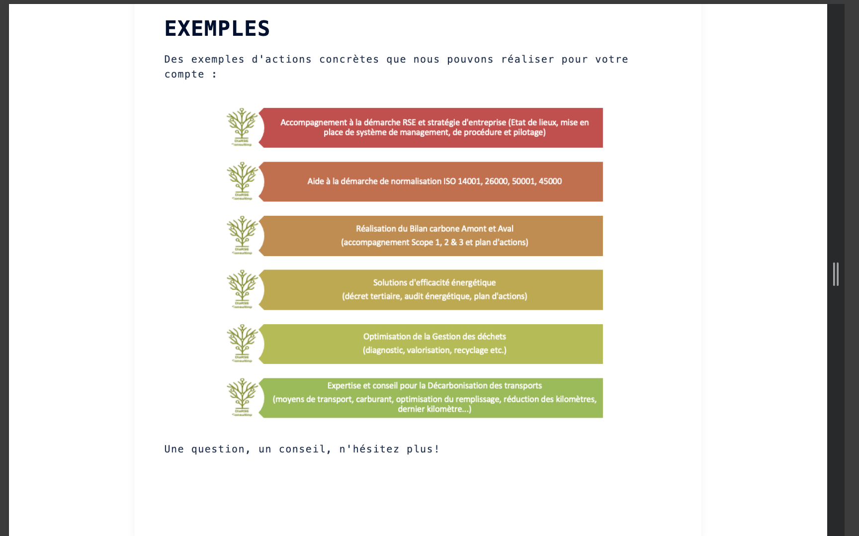
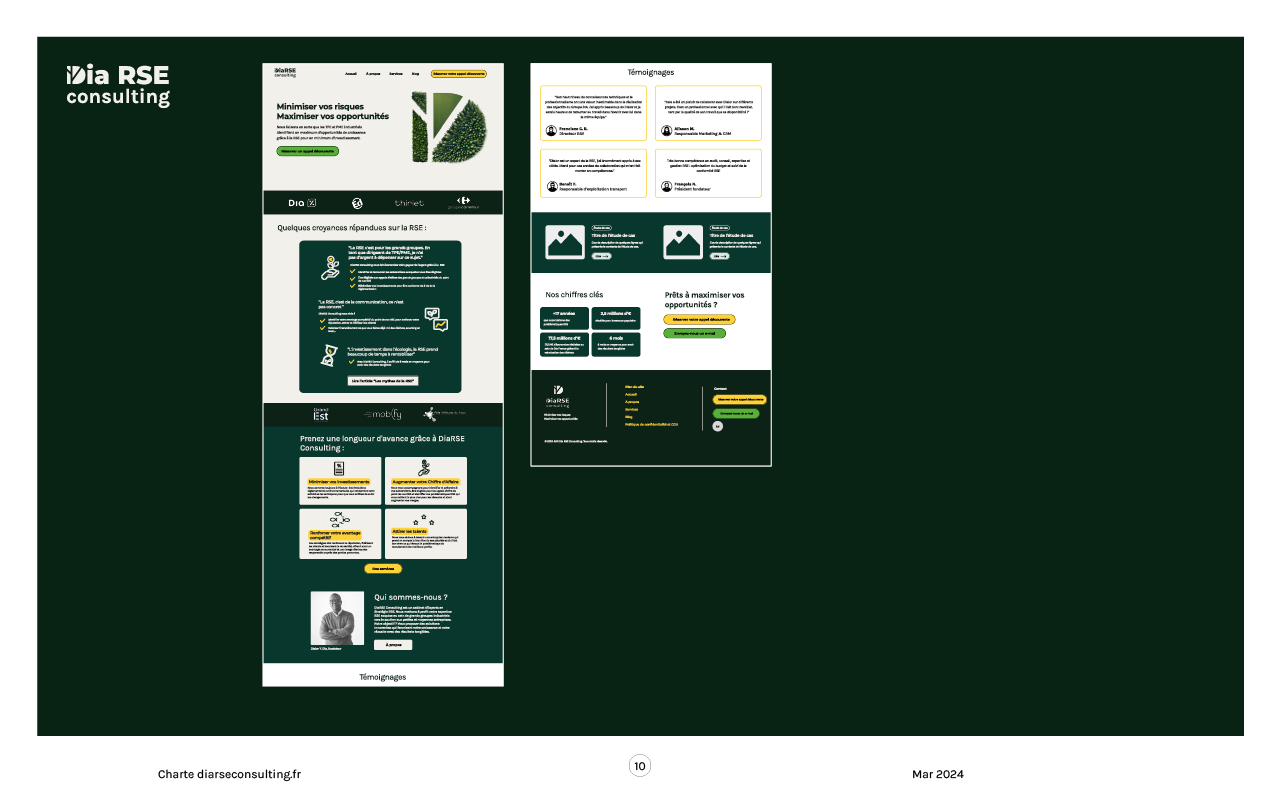
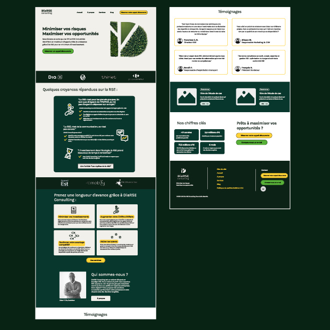
New homepage design
I then created a mockup of the home page on Figma then created the final website on WordPress after approval.
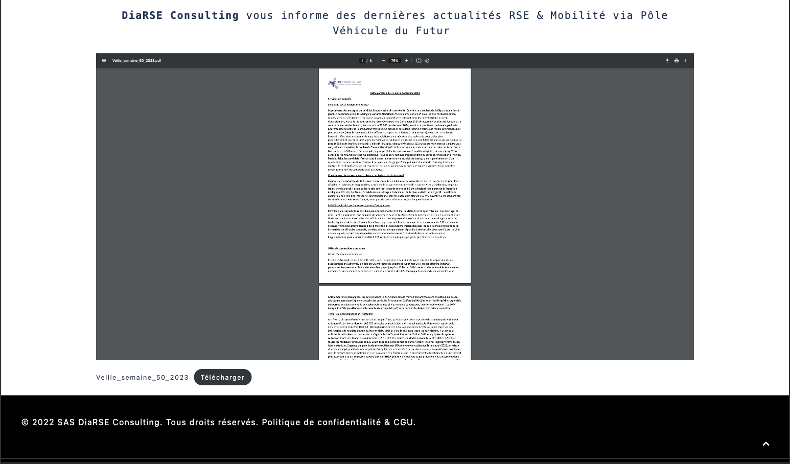
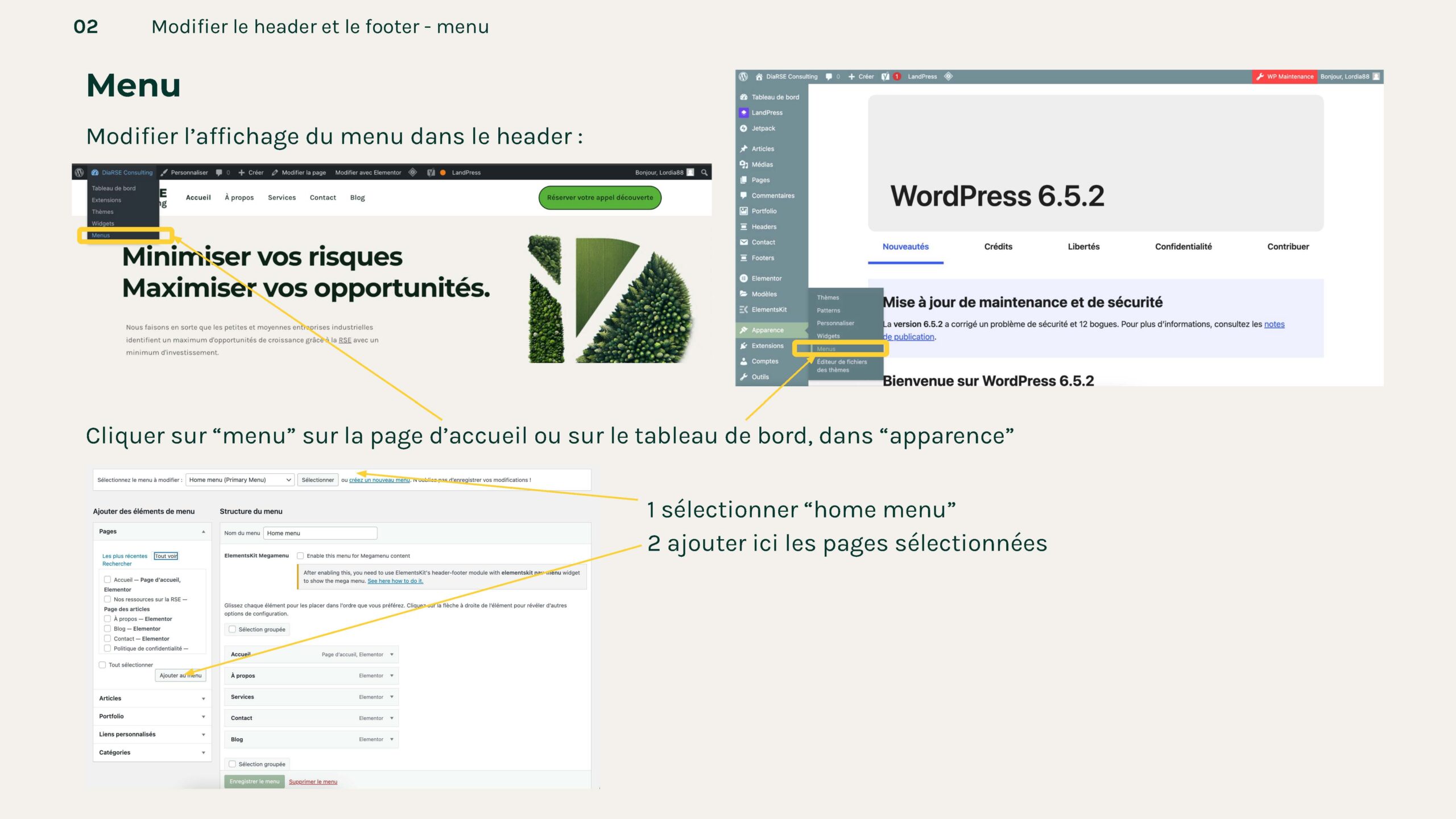
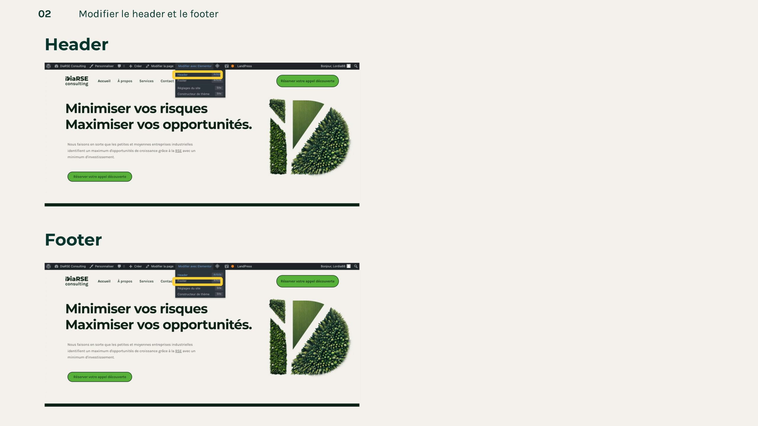
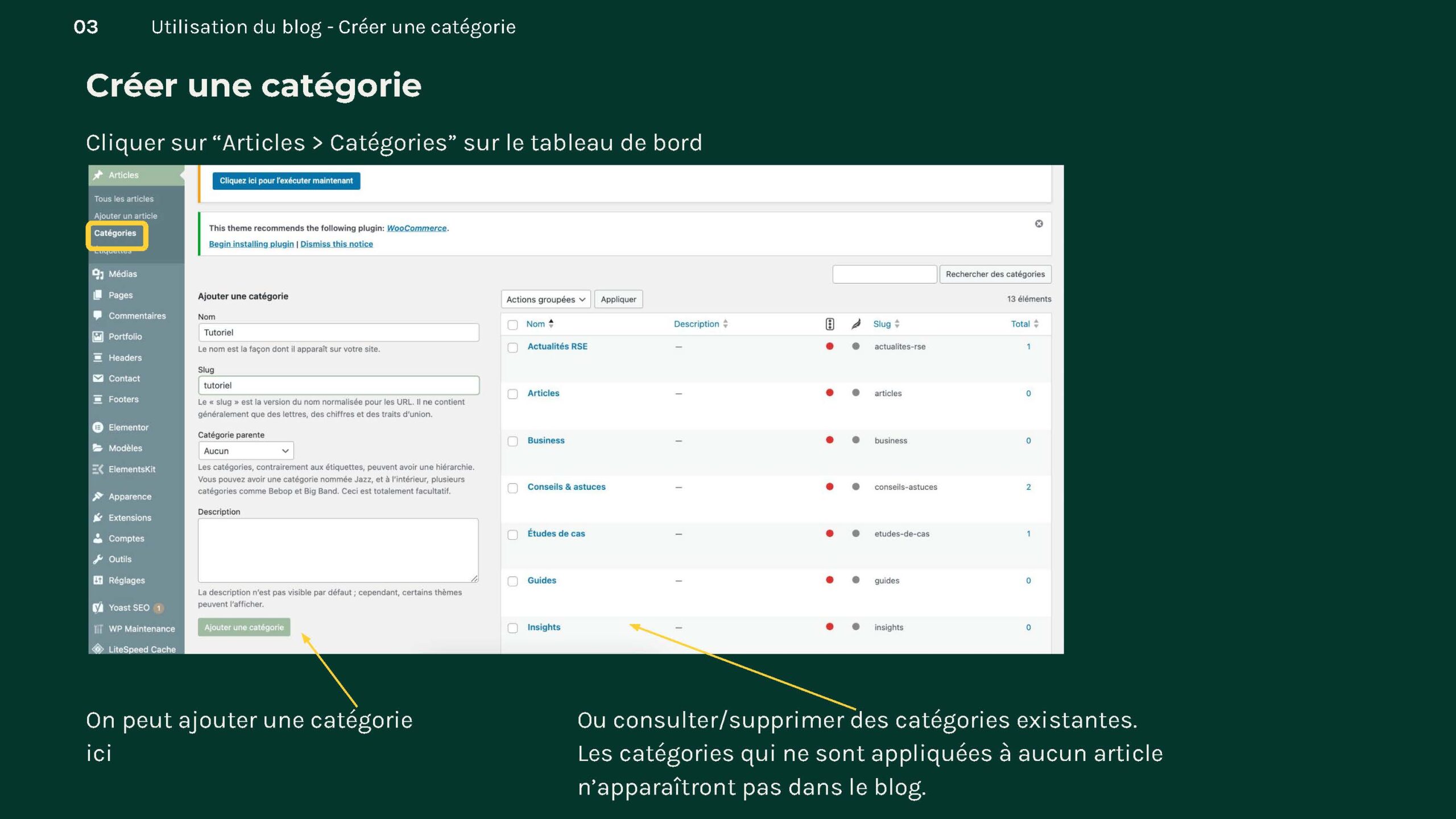
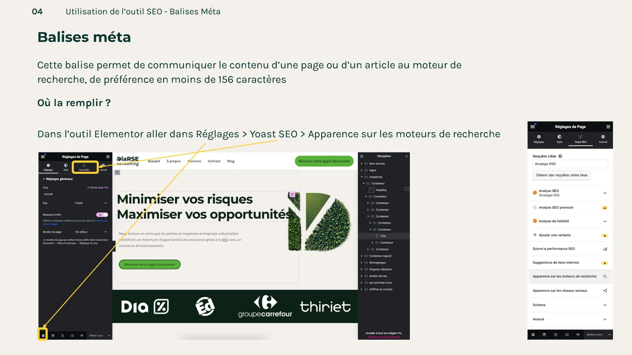
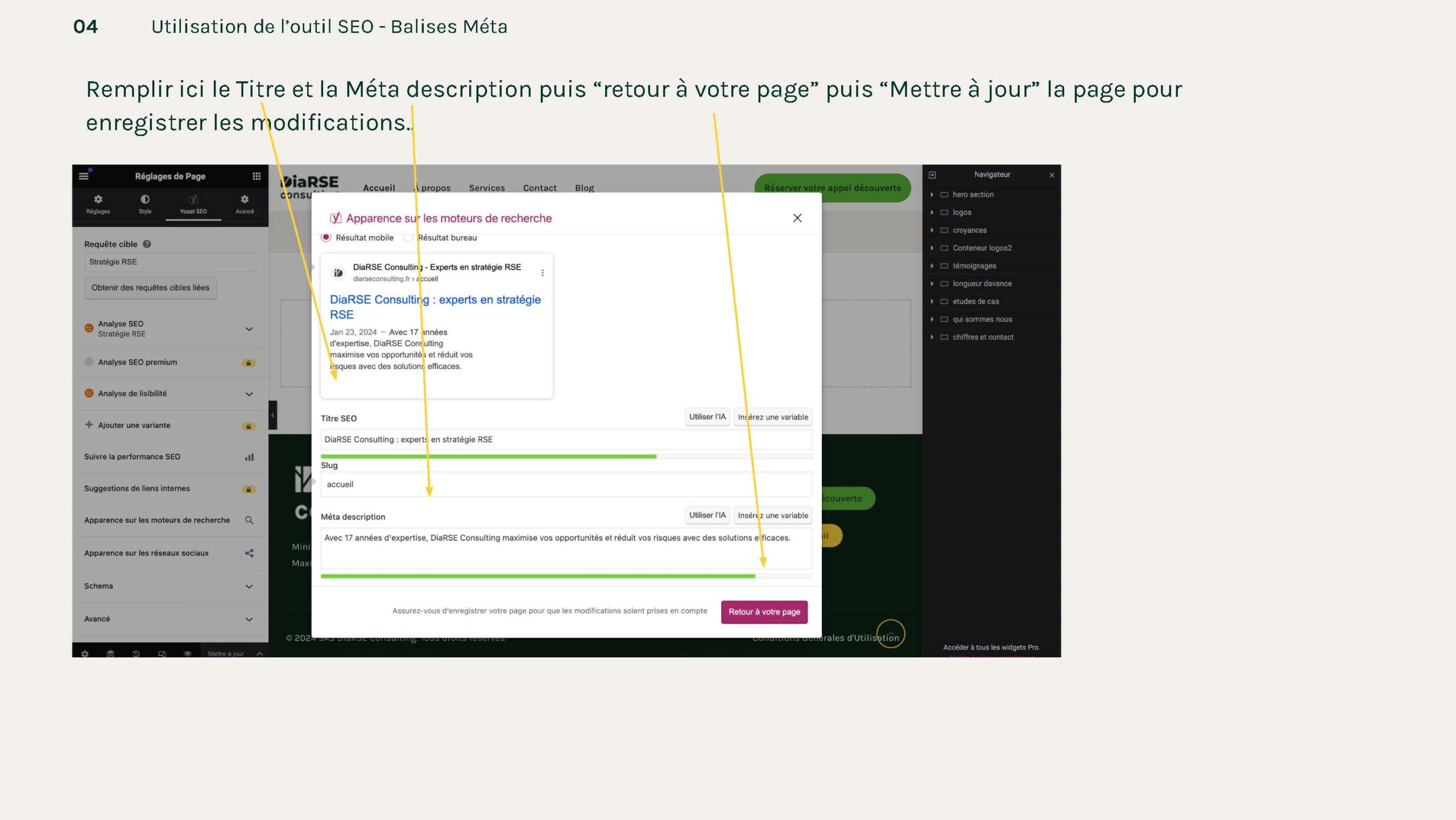
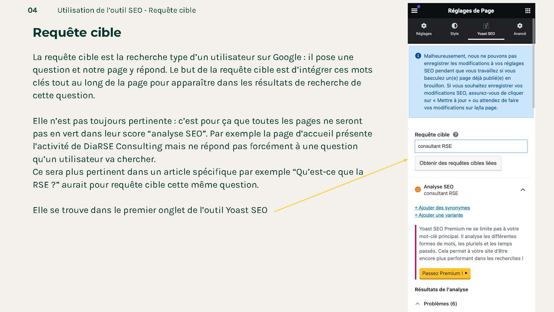
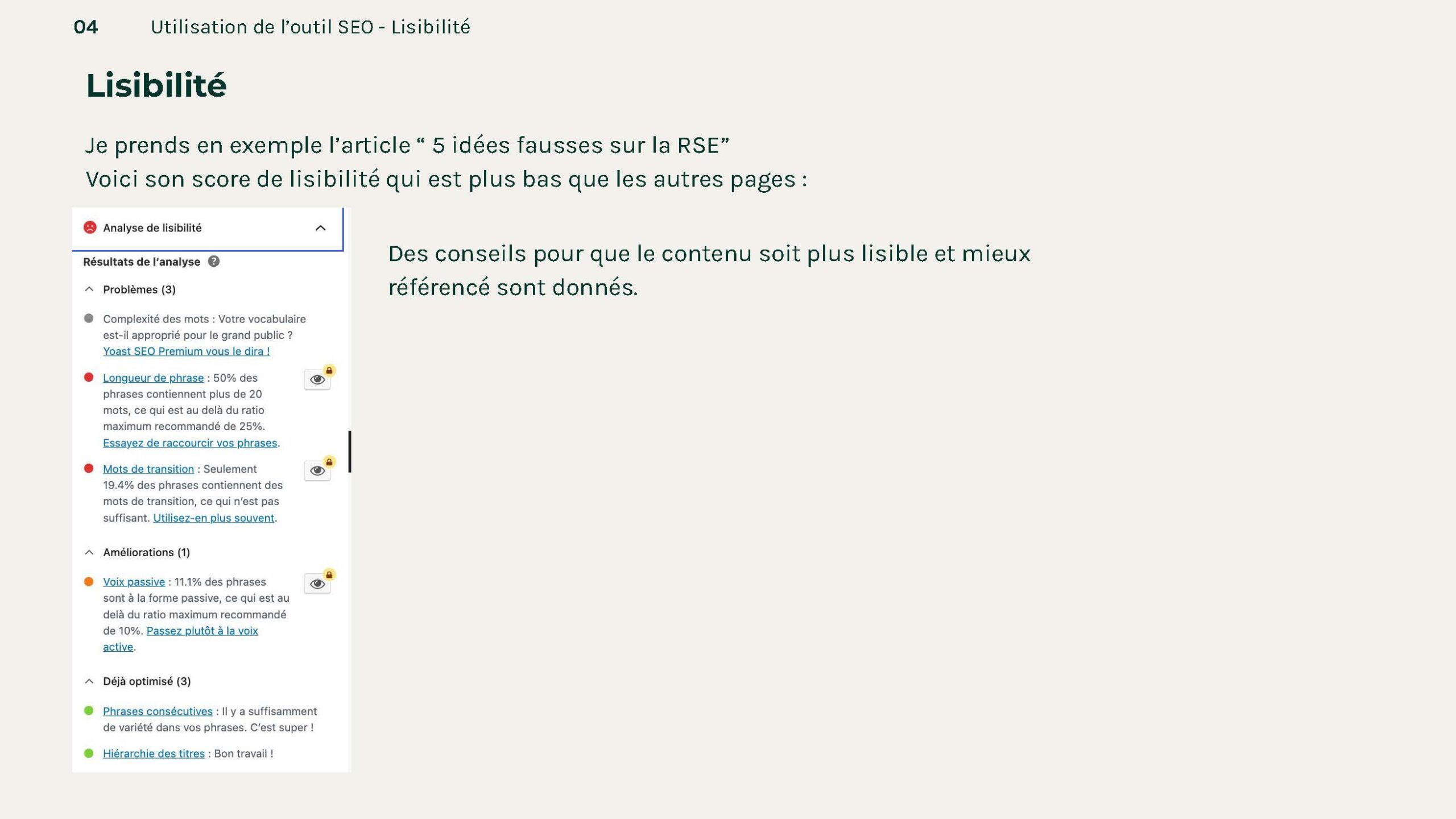
Finally, I created documentation so that Dialor can quickly edit the site and publish articles on the blog section.