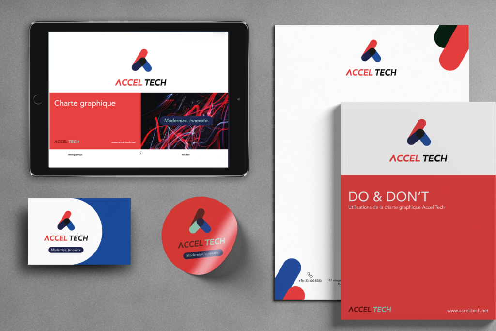
Logo & brand identity refresh for Accel-Tech

Client

Accel-Tech

Digal Consulting

Project

Logo, brand guidelines, branded assets and templates

Context

Accel-Tech is an IT solution company who has successfully expanded into multiple African countries and continues to grow. With its increasing regional presence, the company now requires a cohesive and unified brand identity to maintain consistency, credibility, and recognition across different markets.

Deliverables

  • New logo
  • Brand guidelines
  • Templates for presentations
  • Emailing signature
  • Business cards
  • Letterheads, invoices

Key skills

  • Graphic design
  • Branding
  • Creating documentation
Before
Old logo
After
Impacts
  • Enhanced Brand Consistency: Unified visual and messaging across regions and platforms to increase trust & reliability.
  • Modernized Identity: Reflects cutting-edge technology and innovation.
  • Broader Appeal: Resonates with both global and local markets.
  • Scalability & Adaptability: Easily evolves with company growth and service diversification.
  • Ease of Use for Employees: Accessible brand guidelines, templates, and training for non-designers.

Branding Refresh

Milestones:

Progress

Rebranding Objectives:

  • Brand Consistency: Aligning visual and messaging elements across all platforms and regions to ensure a recognizable and professional corporate identity.
  • Modernized Identity: Enhancing the company’s branding to reflect its cutting-edge expertise in AI, data science, and next-gen IT solutions.
  • Global & Local Appeal: Creating a brand that resonates with both multinational clients and local businesses across Africa.
  • Trust & Authority: Strengthening brand positioning as a reliable, innovative, and security-focused technology partner.
  • Scalability & Adaptability: Ensuring the branding can evolve with the company’s future expansion and service diversification.

To ensure that the new brand identity is practical and accessible for IT professionals and non-designers within the company, the rebranding must prioritize:

  • Standardized Brand Guidelines – A clear, easy-to-follow brand book with predefined templates for presentations, documents, emails, and social media using tools employees already know. 
  • Modular and Scalable Design – Simple, adaptable visual elements (e.g., color schemes, typography, logo variations) that are easy to apply.
  • Training & Quick Guides – create a simple documentation to help employees apply branding effortlessly.

The old logo had the following problems :

  • no longer reflects the client’s modern, cutting-edge identity in AI, data intelligence, and next-gen IT.
  • Lack of Scalability – The logo didn’t adapt well across different formats
  • Not Vector-Based – Without a vectorial format, resizing caused pixelation, making it unsuitable for high-quality applications.
Old logo

Concept: logos proposals

Concept 1 : Acceleration
  • The logo is created using the letters A and T
  • It forms an upward arrow, symbolizing clear direction and continuous growth. Its triangular shape resembles a mountain, a universal symbol of ambition, challenges, and success.
  • The clean, dynamic design ensures a bold and forward-thinking brand identity.
Concept 1
Concept 2 : Connection

The logo, shaped like an “A”, symbolizes the interconnection of technological networks and data flows. This design represents a vast, interconnected network, where each point signifies a connection, data exchange, and continuous progression.

Concept 2
Concept 3 : Fusion

The “T” in Accel Tech is embedded within the “A” of the logo, appearing as pixels or small cubes that form the structure. This design illustrates movement, acceleration, and a company in constant evolution. It symbolizes connectivity, technological advancements, data, and an interconnected network.

Concept 3

Delivery

Logo choice

Concept 1 was ultimately chosen for its simplicity, following a vote from the employees. This decision reflects the company’s commitment to a modern, clean, and easily recognizable brand identity that aligns with its technological expertise and growth vision.

I suggested the color blue, which was highly appreciated for giving the brand a more mature, professional, and calm identity. Blue conveys trust, reliability, and technological expertise, aligning perfectly with the brand’s vision and industry presence.

Brand guidelines

I then created the Brand Guidelines and delivered the following: